One crucial element of any successful large site is navigation. When a site is offering a large number of different services or products, you can’t hope to present them all to the user on arrival. Without successful navigation techniques, users will quickly get lost in the site and be unable to find what they are looking for.
Signposting within pages can play a pivotal role in aiding a user’s navigation through the often numerous and complex choices available to them.
On many sites, the majority of signposting takes place at two different types of page; landing pages and gateway pages.
Landing Pages
A landing page is the page on which a user will enter your site. Often, the homepage is the obvious landing page, but it is increasingly likely that your users will have searched before getting to your site, and so will first arrive somewhere other than your homepage.
This Landing Page will be one of the following page types:
- “The Page” - the right page for the information that they are looking for.
- A “gateway page”, which is not “The Page”, but a page offering the user a gateway into more content, hopefully one of which will lead them directly to “The Page”.
- The wrong place on the site.
While your aim with any site is to optimise the search to the point where the user always lands on the exact page they need, you cannot cater for all users and all searches. People can search very generically, with terms such as “council tax”, where several distinct pages will exist within that subject.
And when users land on your site somewhere before the page they need, they will need a signpost to lead them to where they need to be.
Gateway pages
Unless the user lands on the right page first time, they might well journey through several pages before they reach their goal. At each stage, the user is simply looking to answer the basic questions:
- Is this “The Page”? Does it contain the information I need?
- If this isn’t “The Page”, then how do I get to “The Page”?
This is where gateway pages are useful.
1. Simple and Different
Gateway pages are all about answering this second question efficiently. Gateway pages never have the information the user is looking for_,_ and they should quickly communicate that fact to the user. The best way to do that is to be brief, and to be different.
Be Simple : Don’t fill the page with content. When users are trying to find specific information, they don’t need paragraphs of text telling them things they didn’t want to know. It just creates confusion.
[gallery link=”file” size=”medium” ids=”1642,1641,1551”]
Clear gateway pages offer clarity and don’t clutter navigation with content.
Be Different : Navigational pages should look different to content pages, so users can quickly differentiate between pages with information and pages that signpost.
[gallery columns=”2” size=”medium” ids=”1646,1645”]
Nottinghamshire provide a clear difference between navigation and content. You know whether you are still looking for something, or reading content you’ve found.
2. Focus on the task in hand
Your users might have many and varied tasks in mind when deciding to visit your site, but they will only have one when on a gateway page: How do I get to The Page with the information I need?
Gateway pages need to focus on this task, and deliver the right page, quickly and efficiently to the user.
3. Provide the right “scent”
There are many usability features you can implement to aid the user in finding their way from the gateway page to the real information, and you should certainly use them. But the key to solving your user’s problem lies in what the page says.
Information “scent” is a term used to describe how people evaluate navigation options. When a user is working out where to go next, they will choose the path that gives off the strongest “scent” of the information they are after.
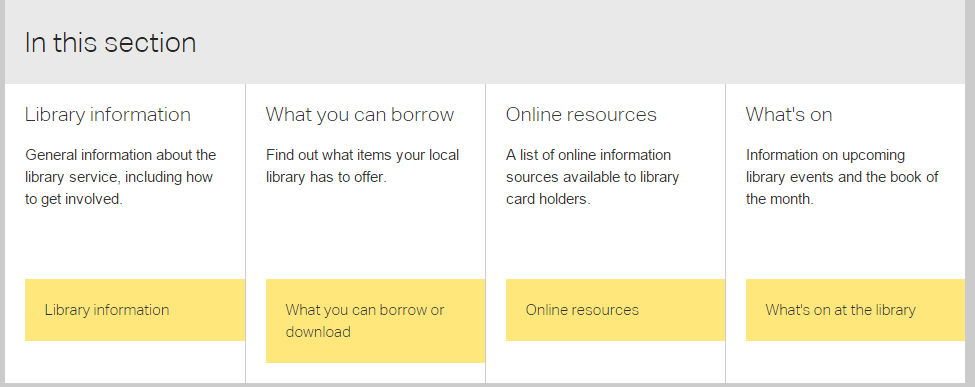 Offering general area headings might be tempting…
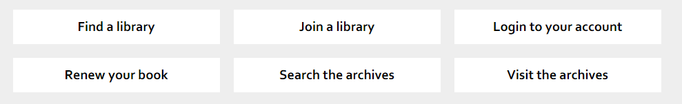 Clear, actionable words are easier to scan.
You can see fairly easily how different the two examples above are. “General information about the library service, including how to get involved” is wordy, and to a large extent, meaningless. Am I “getting involved” if I hold a library card? Or are they fishing for volunteer shelf-stackers? General information probably includes what time the library closes, and how to get to it, but I may not notice, as I’m lost in a sea of words that muddy the meaning, and so muddy my comprehension. The scent isn’t there, or if it is, it’s disguised by a myriad of other smells.
“Find a library” is entirely unambiguous, by comparison. I want a library. That link will help me find one. It has a strong scent of something useful to me.
The titles given to the options play a critical role in defining scent. Too vague, and no one will truly understand what lies below the link. Too specific, and many people will disregard an option, thinking it doesn’t contain what they want to know when, in fact, it does - if “Find a Library” turned out to be a secret passageway to renewing or reserving books, it would fail me, because the scent would be wrong. Fortunately, in this case, it’s not!
A part of the whole
Gateway pages make up just one element of a successful information architecture for a site, but they are important in guiding users to the right place. By following some simple principles you can provide clean, simple navigation to your users that gets them to what they want without too much trouble.